The Shiki Theme Rabbit Hole
Three Themes, One Code Block
This site has three modes - light, paper, and dark - switched off one button in the header. The header, the background, the text color, all of it shifts in one click. Code blocks needed to do the same thing, and that turned out to be a much bigger rabbit hole than I expected.
Code blocks on this site are highlighted with Shiki, and Shiki can bake more than one theme into the same block of HTML at once. Instead of re-rendering the code every time you flip modes, it writes out a small set of CSS variables per token, and my stylesheet decides which set is “active” based on whichever mode you’re in:
// Picks a theme based on the active site mode
import { themes } from "./config";

class ThemeSwitcher {
  constructor(mode = "light") {
    this.mode = mode;
    this.isReady = true;
  }

  current() {
    const fallback = null;
    return themes[this.mode] ?? fallback;
  }
}

const switcher = new ThemeSwitcher("paper");
console.log(`Active theme: ${switcher.current()}`);
Go ahead and hit the theme toggle in the header right now. That exact block above will repaint itself instantly - no flash, no re-render, just a different set of colors taking over. Right now this site maps the three modes to three completely different Shiki themes:
themes: {
  light: 'catppuccin-latte',
  paper: 'everforest-light',
  dark: 'vitesse-black',
}
Mechanically, this was the easy part - a config object and a few CSS variables. The hard part was picking which three themes to actually put in that object.
The Problem With Picking Three
Picking one Shiki theme is easy: scroll through some screenshots, find one you like, done. Picking three that all need to feel like they belong to the same site is a different problem entirely. Light and paper mode are both light backgrounds, so they need to look like two genuinely different rooms, not two slightly-off photocopies of the same room. Dark mode needs to feel like the same site at night, not a different project altogether.
I wanted to compare real candidates side by side - not by reading theme names off a list and imagining what they probably look like, but by actually seeing the same code rendered in a dozen options at once, grouped by mood, so I could shortlist a light one, a paper-ish one, and a dark one without twelve browser tabs open.
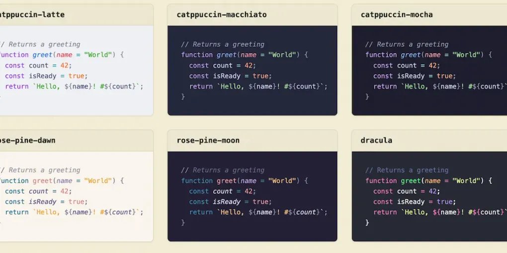
That tool didn’t exist anywhere I could find. Shiki ships with dozens of bundled themes - Dracula, Nord, Catppuccin, GitHub’s own light and dark themes, Gruvbox, Monokai, and plenty of more obscure ones - but the only previews I could find online let you look at one theme at a time through a dropdown. Shiki’s own docs just list the names as plain text, no colors attached. None of it was built for comparing.
So I Built One
A gallery of every Shiki theme, rendered live at build time, grouped loosely by family so the Catppuccin variants sit together, the Gruvbox variants sit together, and so on. The same short sample renders in every theme, so the only thing that changes from card to card is the theme itself.
That’s how I landed on catppuccin-latte, everforest-light, and vitesse-black. Scanning the gallery’s “Catppuccin & Vibrant Pastels” section next to “Gruvbox & Natural Tones” next to “Minimalist & High Contrast” made the differences between candidates obvious in a way that reading three theme names never would have. Catppuccin Latte for a light mode with a bit of personality instead of plain black-on-white. Everforest for paper mode’s warmer, earthier feel. Vitesse Black for a dark mode that’s genuinely restrained - closer to true black than most “dark” themes bother to go, which matches the rest of the site’s dark mode better than anything louder.
Getting each gallery card to show its own theme’s real colors, instead of inheriting whichever mode the site happened to be in while I was building it, was its own small fight - my site-wide styles were actively repainting every card to match the active mode, which is exactly the bug I was trying to avoid in the first place. But that’s a story for the gallery itself, not this post.
If you’re stuck picking your own three (or even just one), it might save you the dozen open tabs.